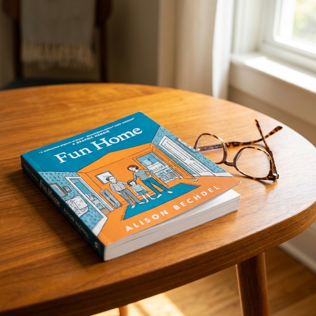
If you have ever opened a manga volume and felt your eyes hesitate like they are stepping onto a moving sidewalk, you are not alone. Manga and Western graphic novels both tell stories with words and pictures, but they have different “grammar.” Once you know what to look for, you start to feel the rhythm: how panels breathe, how action lands, how emotion lingers, and how your brain stitches the moment-to-moment together.
Let’s walk through the big differences I see readers bump into most, especially around panel layouts, pacing, and the storytelling tools each tradition tends to lean on.
Format basics
Serialization shapes structure
A lot of the manga people read in English began life as weekly or monthly serialized chapters before being collected into tankōbon volumes. That origin influences pacing: chapters often end on a sharp emotional pivot or cliffhanger, and scenes are built to be read in quick bursts but remembered for a week.
Western comics have their own serial DNA, too, especially in superhero publishing: single issues, arcs, crossovers, and long-running continuity. Western “graphic novels” also include stand-alone books or limited series designed to read as one complete unit. The key point is that the production pipeline nudges structure, and structure nudges how creators use panels.
Trim size and page turns
Even before you get to art style, the physical object changes how a story “lands.” Tankōbon volumes tend to be smaller and thicker, which can make page-turn reveals feel quick and intimate. Floppy issues and oversized hardcovers give artists more room for big establishing shots or wide, cinematic spreads. None of this is a rule, but format quietly shapes timing.
Color and visual load
Most manga is printed in black and white, with occasional color pages in magazine serialization or special editions. That is not a limitation so much as a language: screen tones, clean silhouettes, and high-contrast blacks become tools for mood and readability.
Western graphic novels and comics are often full color, which adds a whole extra storytelling layer: lighting shifts, palette motifs, time-of-day cues, and emotional temperature can be carried by color alone. That can change how dense a page feels, and where your eye goes first.
Who makes the page
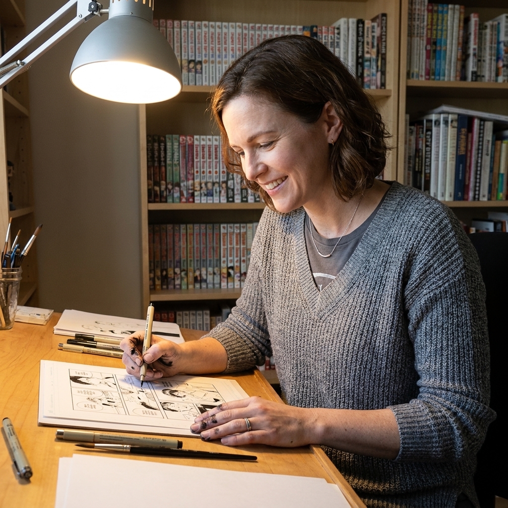
It is also worth noting the labor behind the look. Many manga are created by a mangaka with assistants, which can encourage clean character acting, strong silhouettes, and efficient backgrounds that support fast-paced serialization. In Western comics, it is common to have separate roles (writer, penciler, inker, colorist, letterer), which can create a different kind of polish and can make color and lettering feel like equally central storytelling layers. These pipelines overlap and vary, but they do influence the page’s “voice.”
Moving through the page
Reading direction
The most obvious difference is flow. Manga is typically read right-to-left, top-to-bottom, and most modern English editions preserve that orientation. (If you grew up with flipped editions in the 1990s or early 2000s, you are not imagining things.) Western comics generally flow left-to-right.
But the deeper difference is choreography: the way panels, gutters, and speech bubbles guide your eye. Manga pages often encourage a smooth, continuous glide down the page, using vertical panel stacks and clear motion cues to keep you moving. Western pages, especially in mainstream traditions, often set up strong landing points, and page turns are frequently treated like punchlines or reveals.
Panel shapes
Neither tradition is locked into one format, but there are tendencies:
- Manga frequently uses flexible panel sizes that expand and contract with emotion. A quiet moment might get multiple small panels of micro-expression, then a sudden wide panel opens like a held breath.
- Western comics often use clearer grids or rhythmic panel rows, then break that structure for emphasis with splashes, full-page reveals, or dramatic inset panels.
Think of it as two different kinds of music notation. Manga often writes in phrasing and pauses. Western comics often write in beats and crescendos.
If you want a concrete picture: manga might spend a whole page on a confession with nothing but eyes, hands, and tiny shifts in posture. A Western comic might build to a full-page reveal of the antagonist on the next page, then let your eye hit the composition like a drumbeat.
Pacing
Manga and decompression
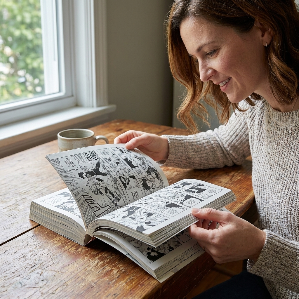
Manga is famous for decompression, meaning it often spends more panels on fewer seconds of story time. That is a broad trend, especially in many action and drama series, not a universal law. Gag manga, older styles, and certain genres can be extremely compressed.
When decompression is in play, it is one reason action in manga can feel so kinetic and readable. Instead of cramming a whole exchange into one panel, a creator can show the wind-up, the impact, the recoil, and the reaction, each with its own visual emphasis.
Decompression also serves quiet scenes. A character making tea, hesitating before speaking, or staring at a text message can unfold across several panels. It can feel intimate, like the story is letting you sit in the feeling rather than rushing to the next plot point.
Western density, then and now
Western superhero comics, in particular, developed a tradition of dense pages: more dialogue, more plot advancement per issue, more “stuff happening.” That density can be satisfying if you love intricate world-building and snappy banter, but it can also feel like a sprint.
At the same time, modern mainstream Western comics have also embraced decompression and widescreen pacing in plenty of books. And many Western graphic novels, especially in indie and literary spaces, use quiet, spacious pacing beautifully. So it is better to think in terms of common habits, not hard borders.
The gutter does different work
The gutter, the space between panels, is where your brain performs its magic trick. Manga frequently relies on small shifts and implied motion in the gutter, creating a film-editing feel: cut, cut, cut. Western comics often use the gutter to jump bigger steps, moving from one story beat to the next with a stronger sense of propulsion.
Visual language
Acting on the page
One of the most delightful differences is how emotion is drawn.
- Manga often uses an expanded emotional vocabulary: simplified or chibi reactions, symbolic sweat drops, stylized shock lines, and exaggerated facial shifts that communicate feeling instantly.
- Western graphic novels vary widely by genre and publisher, but many lean toward expressive realism or stylistic consistency within a given mode, with emotion carried through body language, lighting, and dialogue cadence.
Neither is “more mature” than the other. They are simply different dialects, and both can deliver a gut punch when used well.
Framing and motion
From my seat as a longtime reader, manga often borrows from film language with particular intensity: extreme close-ups on eyes or hands, tight sequences of cuts, and speed lines that turn motion into a visual atmosphere. Western comics can be just as cinematic, but they also frequently emphasize iconic composition: the hero pose, the tableau, the big establishing shot that announces a place or a threat.
Story conventions
Genre lanes
Manga is often categorized by demographic magazines were marketed to, like shōnen, shōjo, seinen, and josei. Those labels are not rules, but they do influence common themes and pacing choices. For example, shōnen stories often emphasize growth arcs and team dynamics, while shōjo frequently foregrounds interior emotional landscapes and relationship tensions.
Western graphic novels are more likely to be shelved by genre or imprint: superhero, memoir, fantasy, horror, literary fiction, YA, and so on. Superhero continuity remains a major pillar, which shapes how long arcs, reboots, and shared universes operate.
One small clarification: “Western graphic novels” is a huge umbrella, and I am mostly talking about mainstream tendencies versus common manga publishing habits. There are exceptions in every direction, and thank goodness for that.
Captions and interiority
Western comics have a strong tradition of caption boxes: internal monologue, noir narration, time and place stamps, editorial voice. Manga uses internal monologue too, but often lets the art carry more of the interiority through reaction panels, symbolic backgrounds, and pacing that lingers on a character’s face.
If you have ever thought, “Why is this manga scene just someone looking out a window for three panels?” the answer is often: that is the narration. The pause is the voice.
Translation and lettering
Sound effects
Manga sound effects are frequently integrated into the art as hand-drawn text. English editions handle this in different ways: leaving the original Japanese, adding small translations nearby, or replacing effects entirely. Each choice changes your reading experience. Leaving the original preserves the page’s design. Replacing can improve instant comprehension, but it can also alter the visual balance.
Bubble density
Western comics have a long lettering tradition with distinct balloon shapes, tail styles, and font conventions. Manga translations often use clean, readable fonts and place dialogue carefully to preserve the original panel flow. Because manga can be more decompressed in many series, you will sometimes see fewer words per page, which makes emotional beats land in a different register.
Which is better?
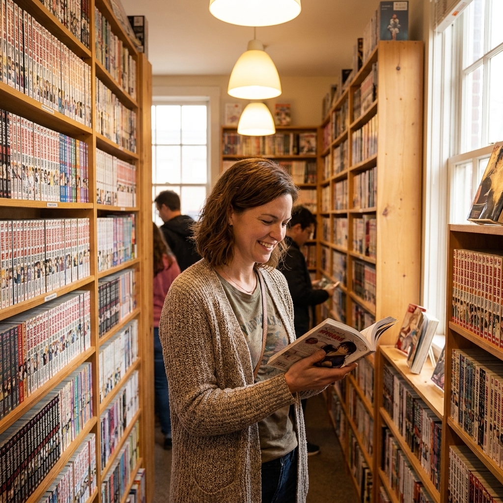
This is the part where my former-bookstore-manager heart wants to gently take your elbow and guide you away from the debate aisle. Manga and Western graphic novels are not competing so much as offering different reading pleasures.
- If you crave immersive pacing, emotional close-ups, and action you can feel in your bones, manga can be pure oxygen.
- If you love dense plotting, big mythologies, and color-driven atmosphere, Western graphic novels and comics can be incredibly satisfying.
And of course, the best answer is often: both. Your shelf can hold multitudes. Mine certainly does, precariously.

Quick tips
- Give your eyes a warm-up. For manga, slow down for the first few pages and follow speech bubbles carefully. Your brain adapts quickly.
- Let the page set the tempo. If a manga gives you three panels of silence, read them like a pause in music, not empty space.
- Notice what carries meaning. In many Western books, color and captions often do heavy lifting. In many manga, composition, screen tone, and repeated reaction panels often do.
- Try “bridge” titles. Many readers fall in love through works that already play with both traditions, like cinematic Western graphic novels or manga with especially strong literary narration.
FAQ
Is manga a kind of graphic novel?
In the broadest sense, manga is comics, and collected volumes can absolutely be considered graphic novels in format. The word “manga” usually signals a Japanese origin and a set of visual and publishing conventions.
Why is manga often black and white?
Speed and cost in weekly and monthly serialization are big reasons, but it also became an aesthetic tradition. Many artists use black, white, and screen tones with incredible sophistication.
Do Western graphic novels always read faster than manga?
Not always. Many Western pages contain more text and plot movement per page, which can feel “faster” in terms of story progression. Many manga spend more space on the moment, which can feel slower but more immersive. But either tradition can move at any speed depending on the creator and genre.
Why do manga fights take so many pages?
Because the fight is rarely just a fight. It is character revelation, emotional stakes, tactical thinking, and visual choreography. Decompressed pacing lets each beat land clearly and dramatically.