One of my favorite indie bookstore truths is this: people do not “hate classics.” People hate feeling locked out of them.
Graphic novel adaptations are such a generous invitation back in. They keep the bones of a story you have heard about for years, then hand you a visual language for mood, pacing, and character that can make everything click. Sometimes it is a faithful retelling. Sometimes it is more like a stage production with a daring director. Either way, when it works, it feels like a classic just opened the door, offered you tea, and said, “Come on in, we have been waiting.”
Quick note on my definition of “classic” here: I mean both the old guard (ancient epics, Shakespeare, 19th-century staples) and modern classics that show up constantly in classrooms, book clubs, and cultural conversations.
A quick note on how I chose these: I prioritized adaptations that are widely available (especially through libraries), keep the big themes intact, and actually use the comics form on purpose, not just as decoration.
And because some of these stories go to dark places, a gentle heads-up: several picks include violence, sexual violence, racism, war trauma, or oppressive political systems. I flag the heaviest ones in the list.
Below are ten adaptations I recommend constantly, especially to readers who want the heart of the original with art that does real storytelling work.
What makes a great adaptation?
Before we dive in, here is the quick litmus test I use:
- Clarity without flattening. It should help you follow the plot without sanding off what makes the book strange, intense, or specific.
- Art that carries meaning. Color palettes, panel rhythm, facial expressions, and page turns should do emotional heavy lifting, not just decorate the text.
- A point of view. The best adaptations know what they want to emphasize, whether it is dread, romance, satire, grief, or wonder.
1) The Odyssey
By: Gareth Hinds (writer and artist)
If you have ever thought, “I should read The Odyssey but I do not know where to start,” Gareth Hinds is your answer. His adaptation is clean, cinematic, and easy to follow. It gives the monsters their thunder, and it makes room for the long ache of homecoming.
Why it shines: Hinds is excellent at visual geography, so you always know where you are in the story, even when the gods get meddlesome.
Look and feel: Clear linework, steady pacing, and page turns that keep the journey moving.
Format note: Full color.
Best for: Myth lovers, fantasy readers, and anyone who wants the “full journey” feeling without getting lost in footnotes.
2) Beowulf
By: Santiago García (writer) and David Rubín (artist)
García and Rubín make Beowulf feel like a myth told by firelight and then immediately turned into a fever-dream action opera. The art is bold, muscular, and relentless, which is exactly the energy this story wants.
Why it shines: The adaptation embraces the brutality and the tragedy, especially the sense that heroism and doom can be roommates.
Look and feel: Explosive color, big shapes, and a mythic scale that never plays small.
Format note: Full color.
Best for: Readers who like their classics loud, vivid, and a little bit wild.
3) The Iliad
By: Gareth Hinds (writer and artist)
War stories can blur into a parade of names, but Hinds gives The Iliad crisp momentum and an emotional throughline. You feel the pride, the grief, the petty feuds that turn catastrophic, and the awful humanity underneath the “legend” of it all.
Why it shines: Battles are legible and tense, but it is the faces, the pauses, the aftermath that really stay with you.
Look and feel: Clean staging and readable action, with strong emphasis on expression and quiet aftermath beats.
Format note: Full color.
Best for: Readers curious about Greek epics who want the moral complexity front and center.
4) The Trial
By: Franz Kafka (original) and Chantal Montellier (adaptation, writer and artist)
Kafka can feel like a locked room that keeps adding doors. Chantal Montellier’s adaptation leans into that claustrophobia with stark visuals that make the bureaucracy feel endless and predatory. If you have ever felt swallowed by paperwork, systems, or vague accusations, this one hits hard.
Why it shines: The art communicates dread quickly, and the pacing mirrors the story’s spiraling helplessness.
Look and feel: High-contrast, boxed-in compositions that make corridors and offices feel like traps.
Format note: Black and white (most editions).
Best for: Readers who like psychological tension, dystopian vibes, and existential unease.
Edition note: Credit lines can vary by English edition (some list a translator prominently). For maximum accuracy, match the adapter credit to the title page of the edition you buy or borrow.
5) The Metamorphosis
By: Franz Kafka (original) and Peter Kuper (adaptation, writer and artist)
One of Kafka’s most enduring setups is also his most weirdly tender: a man wakes up transformed, and the real horror is not the body, it is the family response. Peter Kuper’s adaptation uses expressive, sometimes oppressive composition to make you feel Gregor’s isolation in your bones.
Why it shines: Kuper’s art captures both the grotesque and the quietly heartbreaking. It is uncomfortable in the way the story demands.
Look and feel: Heavy shadows, anxious angles, and panels that can feel too tight for comfort.
Format note: Black and white.
Best for: Readers who want classics that are short, sharp, and emotionally haunting.
6) The Handmaid’s Tale
By: Margaret Atwood (original) and Renée Nault (adaptation, writer and artist)
Atwood’s novel is already intensely visual, and Renée Nault’s adaptation understands that power. The color choices and page design do a lot of quiet work, making the world feel controlled, ceremonial, and constantly watched.
Why it shines: It translates the book’s interior tension into compositional pressure, with panels that can feel boxed in or eerily spacious at exactly the wrong moments.
Look and feel: A restrained palette and deliberate layout that reinforces surveillance and control.
Format note: Full color.
Content note: Sexual violence and state oppression.
Best for: Readers who want a faithful adaptation with a strong, modern visual voice.
7) Slaughterhouse-Five
By: Kurt Vonnegut (original), Ryan North (adapter), and Albert Monteys (artist)
Vonnegut’s time-skipping, grief-soaked satire is tricky to adapt because it relies on rhythm and sudden emotional whiplash. Ryan North and Albert Monteys pull it off by leaning into comics’ natural ability to jump through time with a single page turn.
Why it shines: The adaptation keeps the strange humor while letting the sadness breathe. It also uses visual motifs to connect moments that the prose links through repetition.
Look and feel: Lively cartooning and clean panel flow that makes the tonal shifts land.
Format note: Full color.
Content note: War violence and trauma.
Best for: Readers who like dark comedy, war literature, and experimental structure.

8) Kindred
By: Octavia E. Butler (original), Damian Duffy (adapter), and John Jennings (artist)
Kindred is one of those books that grabs you by the collar and does not let go. Duffy and Jennings honor Butler’s tension and moral urgency with art that stays grounded and clear. When the story snaps between time periods, the visuals make the disorientation immediate.
Why it shines: The adaptation preserves the novel’s escalating stakes and emotional complexity without softening the horror of what is depicted.
Look and feel: Direct, readable storytelling with strong contrast and a steady build of pressure.
Format note: Black and white (most editions).
Content note: Enslavement, racism, violence, and sexual violence.
Best for: Readers who want a modern classic with intensity, empathy, and a lot to discuss afterward.
9) Jane Eyre
By: Charlotte Brontë (original) and an adapted graphic novel edition (credits vary by publisher)
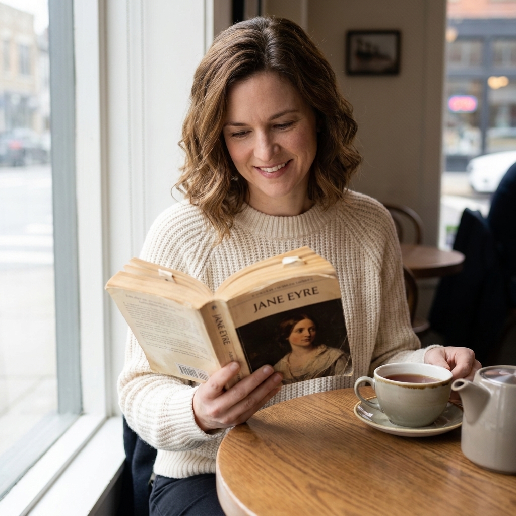
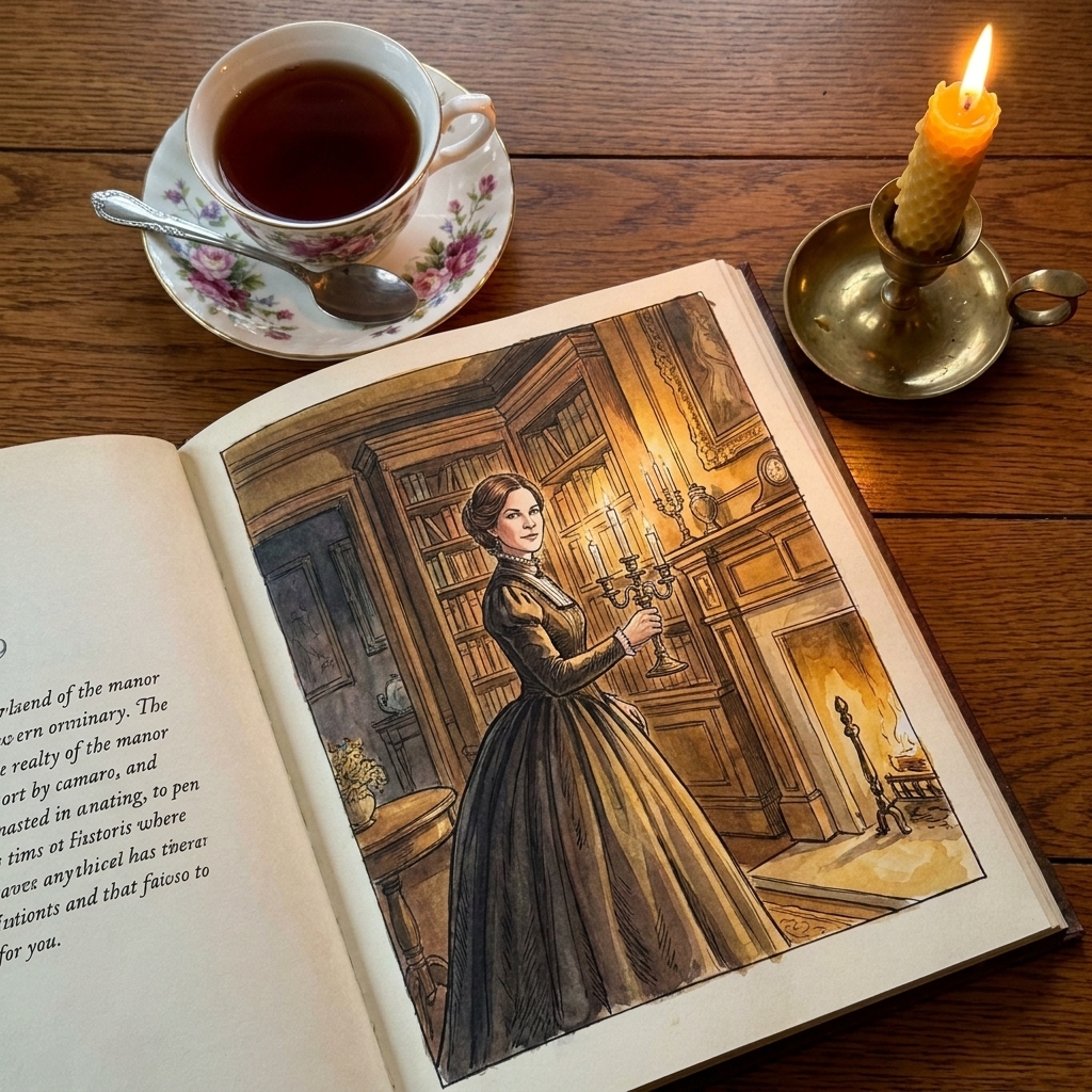
Some classics get remembered as “romantic” when they are actually about survival, autonomy, and insisting on your own moral compass. A good Jane Eyre adaptation delivers the goth mood, yes, but it also keeps Jane’s sharp inner life at the center.
Why it shines: In the best editions, the emotional beats stay clear even in condensed form, and the visual atmosphere does a lot of work, from cold school halls to looming Thornfield shadows.
Look and feel: Gothic atmosphere, expressive faces, and lots of weather in the background of the story.
Format note: Varies by edition.
Best for: Readers who love gothic fiction, slow-burn yearning, and stubborn heroines.
Edition note: There are multiple graphic novel adaptations in circulation, including educational and library editions with different adapter and artist credits. If you want to recommend or buy a specific one, check the title page for adapter, artist, and publisher details, since the “Jane Eyre graphic novel” shelf is not one single book.
10) Macbeth
By: William Shakespeare (original) and Gareth Hinds (adaptation, writer and artist)
Shakespeare in comics form can be a lifesaver, especially when the adaptation respects the language while giving you a visual roadmap for who is who and what is happening. Hinds’s Macbeth is moody and readable, with a sense of dread that builds scene by scene.
Why it shines: It helps you track power shifts and betrayals, and the visual drama pairs beautifully with the play’s intensity.
Look and feel: Dark, theatrical staging with strong silhouettes and ominous page turns.
Format note: Full color.
Content note: Violence and murder.
Best for: Students, Shakespeare skeptics, and theater lovers who want a fresh angle on a familiar tragedy.
Where to start
If you are dipping a toe in, here are a few easy entry points based on your reading mood:
- For pure momentum: The Odyssey or Beowulf
- For a short, powerful gut-punch: The Metamorphosis
- For modern classic intensity: Kindred or The Handmaid’s Tale
- For “I have to read this for class” energy: Macbeth or The Iliad
And a tiny permission slip from your friendly neighborhood former bookseller: you are allowed to read the graphic adaptation first. If it sends you back to the original with curiosity instead of dread, it did its job.
FAQ
Are graphic novel adaptations cheating?
No. They are a different form. A good adaptation is interpretation, not a shortcut. You are still engaging with plot, character, theme, and craft, just through images and panel pacing instead of only prose.
Do these adaptations use the original language?
It varies. Shakespeare adaptations often keep a good amount of the original text, while novels are usually rewritten to fit comics structure. If you love original language, start with Macbeth. If you want clean, modern readability, Kindred and The Handmaid’s Tale are great.
Which one is best for a reading slump?
The Odyssey is my go-to for pure story propulsion. For something shorter that still feels profound, try The Metamorphosis.
If you tell me what you usually like (myths, horror, romance, dystopia, satire), I can point you to the best starting pick, or a few more adaptations in the same lane.